We’re almost out of the first quarter of 2019 and that means this year’s most fashionable trends for paint colors for your abode are starting to crystalize. Perennially, Spring has been a great time to tackle home improvement projects like painting, and mixing up the colors you surround yourself with can be a great way to change your mood, clean things up a bit, and deepen how you feel about your particular surroundings.
It’s a very mixed reaction this year from designers, who are stretching their palettes from dark and woodsy greens to the occasionally jarring ebony wall to accent personal spaces like bedrooms and bathrooms.
Sure, there are the usual suspects like Pinterest, which likes the very hot mustard yellow as well as painted geometric patterns, while Pantone went with a bright coral blue as their color of choice for the year. Meanwhile, Benjamin Moore went with a super-popular Lilac Grey which is not only ostensibly classic but also more gender-neutral, warmer and cheery, especially compared with the evergreen (so to speak) shades of pink.
Here are some of the hottest paint colors that are trending in 2019.
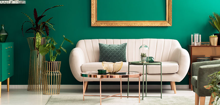
Deep, Dark, Greens
It would seem that if you’re in California, Oregon, Colorado or Alaska, there’s a trend towards adopting a deep, dark green that seems to translate the current mood of its residents towards lush botanicals and the healing power of nature. Pantone named the shade, which is officially and Game of Thrones-y called “Night Watch,” as one of its top 2019 paint colors. While it’s a bit of a retro throwback — here we nod to the
Hunter Green that was so popular in the age when Weezer and Britney Spears topped the charts —this is a great choice for well-lit, spacious rooms that allow the mind and body to stretch out.
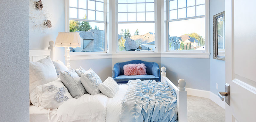
Always, the Blues
Blue is named as people’s favorite color all the time as it not only complements the greens we mentioned above but evokes a sense of calm that people often find from staring at the sky or the sea and getting the chance to take a breath. It’s also a serious go-to for more traditional interior designers who favor a more casual approach to the hues of a room, as deep blues, ice blues, and a newly inspired pale powder blue can evoke the feeling a designer is after without capturing a room’s attention, not to mention those who live within. You can also firmly place within this category the non-color decorators often call “mist,” which offers itself as a gift to designers who want a more flexible color for the canvas to background their colors and style choices.
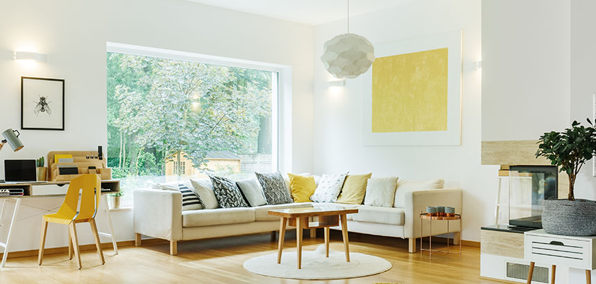
Mustard Yellow
If we could get designers to replicate the color of
Zatairan’s hard-to-find Creole Mustard, we’d be all set but, in the meantime, we’ll have to settle for the pop of color that is generic Mustard pain for accents, trim and other applications that create depth and offer big rewards, even for more conservative uses.
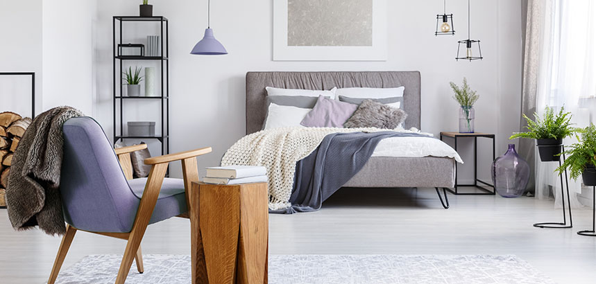
And Now, the Grays
Dove gray is always going to be a perennial go-to for interior designers but many are turning this year to a moodier alternative called Lilac Gray that offers a warm, minimalist feel without giving residents the more neutral feeling that traditional grays can evoke.
Go Nuts
For those who are looking for something a little warmer and inviting, several shades of auburn can do the trick, including Hazelnut, which can brighten a room and reflect more light, as well as Mushroom, an inviting alternative to old-school browns, bronzes and rust colors that evokes the natural world as well as accenting natural furnishings.